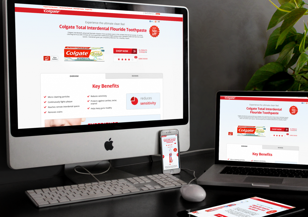
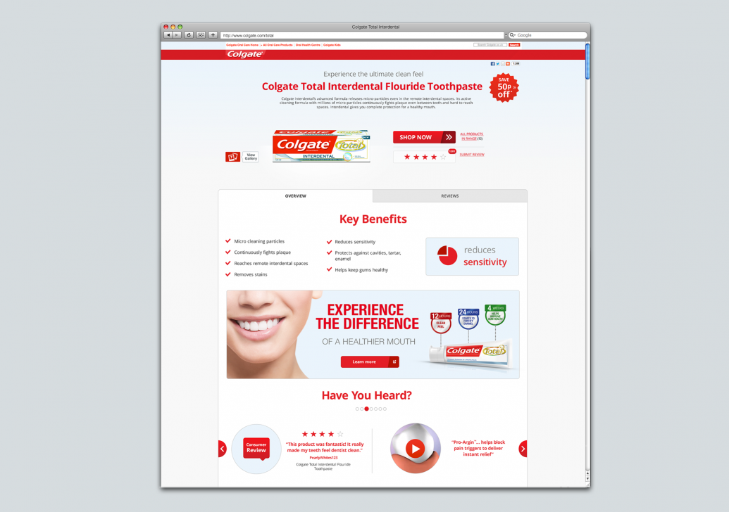
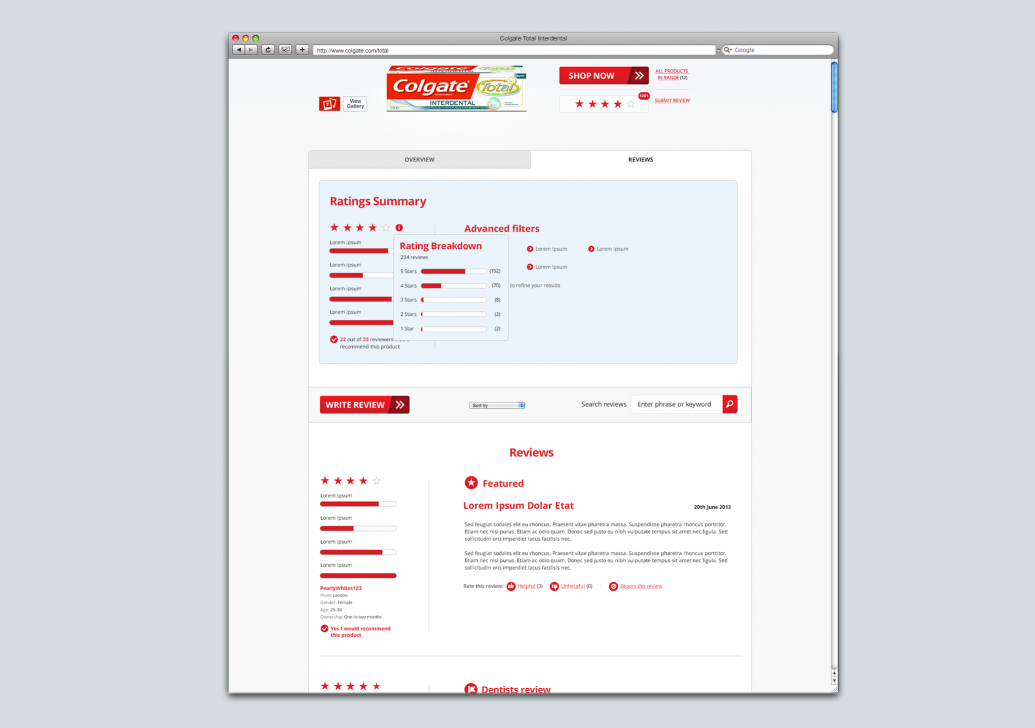
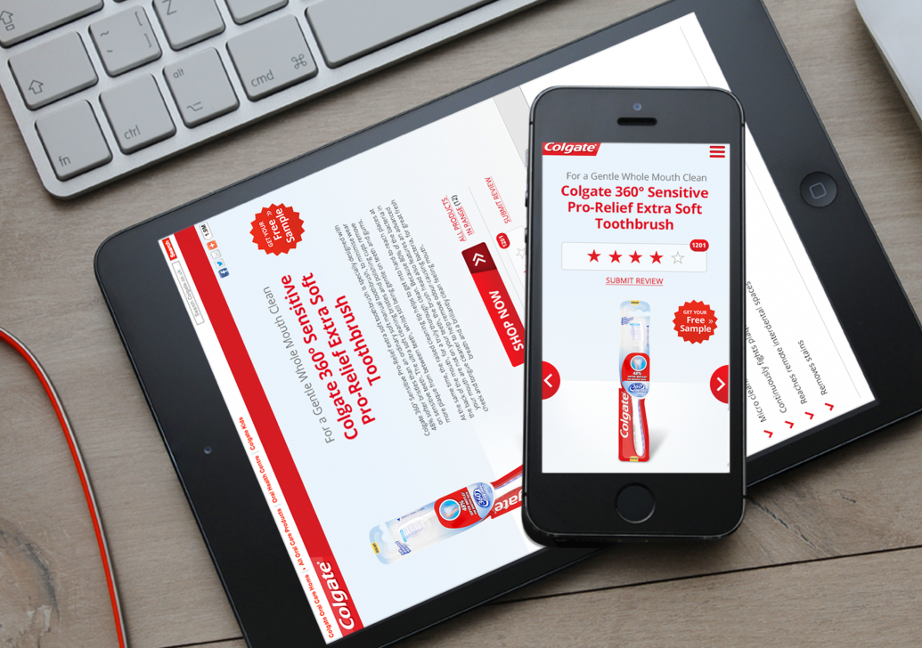
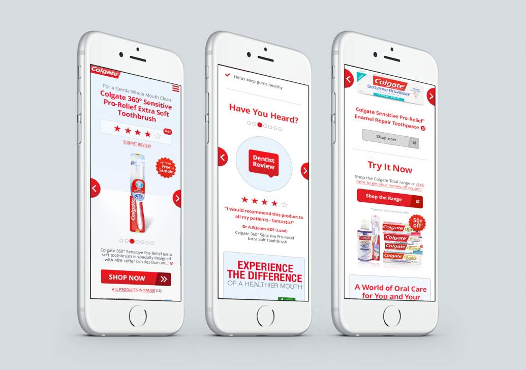
Colgate responsive redesign of all their product pages. This project was designed in close collaboration with UX to get the most user-friendly result possible, it had to work across every device to the very best level possible. All aspects of the design were carefully considered – so that the experience was flawless. The pages were designed to several break points to ensure it was built perfectly by the coders. Guidelines were created for the Design and Development teams to ensure the project was future-proof for coding and any future revisions and updates. Skills: Design, art direction & retouchingColgate
Responsive, Websites
